With the introduction of the iPhone 6 and iPhone 6 Plus, there is now no denying the popularity – and demand – for large-screen devices. Perhaps the most famous and prolific of the smaller screen holdouts, the iPhone represented a bygone era; one in which devices were designed to fit nicely in your pocket, but perhaps not with ease of use in mind. But now that the larger iPhone 6 has ushered in a new era at the world’s largest technology company, the writing is on the wall. With devices like the iPhone and iPad Air getting ever larger, the era of the large display has proudly arrived.
It’s Time to Reconsider the Browsing Experience
So what are the potential repercussions of larger screens on traditionally mobile devices? What does it say about users, and the public in general, that mobile devices are growing in size with each passing year? And does it foretell a time when mobile devices will no longer be, well, mobile? We may not be able to answer all of these questions, but in general, it can be stated without too much controversy that screens are growing in size because people are increasingly turning away from their desktop devices and towards their smart devices for everyday use. With smartphones, tablets and phablets becoming much more than mere novelties – in fact, they have become the new computers – it was perhaps inevitable that screens would grow in size to accommodate the devices’ new roles.
If it’s true that individuals are increasingly using their mobile devices for everything from Internet browsing to online purchases to banking – and let us state plainly that they are – then it is also true that companies which previously designed their websites primarily for a desktop viewing experience need to reevaluate their approach to how people view the Internet. A business that fails to develop a mobile-friendly website runs the real risk of alienating its customer base and losing its competitive edge. Mobile is the future of Internet use, and making a website that is compatible across devices is as important as it once was to make a website that was compatible across browsers.
What Is a Mobile-Friendly Website?
The easiest way to answer this question might be to state what a mobile-friendly website is not: a mobile website is not a separate and unique website, wholly different from its desktop version. Though this might have been the case four or five years ago, when smartphones were first arriving into the marketplace, that is no longer true. Now, a mobile-friendly website is one that is mobile-responsive, capable of adapting and changing as needed to fit the screen that it’s on, but maintaining its core elements, from content to design.
But why is a mobile-responsive site needed? In simple terms, mobile websites live by a different set of rules. Buttons and links are generally larger, extraneous information might be marginalized, layouts become more vertical (or horizontal, depending on the screen), and the interface morphs so that it is better suited to a touch screen, as opposed to a desktop monitor. As the name implies, a mobile-friendly website is one that provides a friendly and pleasant user experience for individuals on mobile devices – not one that is frustrating and unsatisfying. Think of how annoying it is to have to tap, pinch and zoom; mobile-friendly websites aim to eliminate this.
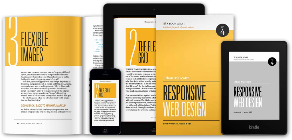
Source: http://www.abookapart.com/products/responsive-web-design

Mobile is the Future – Are Businesses Ready?
With phablets, tablets and smartphones selling like hotcakes (no doubt spurred on by companies like T-Mobile offering free 4G LTE for devices like the iPad Air and Galaxy Note 4), businesses would be well-advised to hop on the mobile-friendly bandwagon now, before it’s too late. Think about how often you use your smartphone or tablet to view the Internet (the odds are good you’re using one right now), and then let that answer the question of whether it’s important or not for companies to develop websites for mobile. The answer couldn’t be more clear.
Source: http://autopilotonlinesuccess.com/responsive-design/2362/

About the Author
Jessica Oaks is a freelance journalist who loves to cover technology news and the way that technology can make life easier. She is also an editor at www.freshlytechy.com. Follow her on Twitter @TechyJessy.


